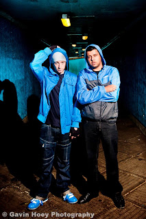
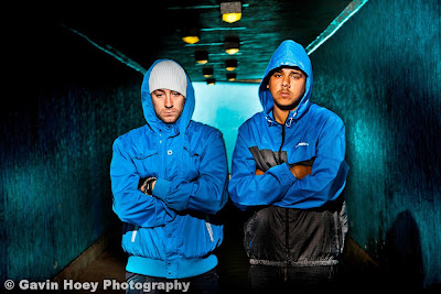
 Today was a good photography day. I was able to get out of the studio and into the real world, which turned out to be a dark, scary underpass where I photographed a right pair of dodgy looking characters.
Fortunately I know these two guys pretty well and have photographed them several times before. They are iF-e and GManHatton, a couple of Grime artists (a type of Rap music check out their website) from Crawley and despite appearances they’re both amazingly polite and great fun to work with.
They're about to release their second joint album and booked me to do the press / promo shots and the CD cover art. So after arranging to meet them in a Tesco car park we headed to a local underpass which I checked out a few days earlier.
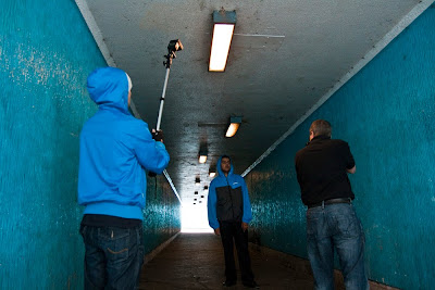
The whole shoot was lit with a single speedlite (Canon 580EXII) as I wanted to perfect my strobist (off camera flash) skills. As soon as I saw the images on the cameras LCD I knew this was going to be a great shoot.
This kind of portrait lives and dies on perfect lighting control and getting it right is a three step process.
 Step one: Unless you want your subjects to be against a jet black background you’ll want to mix the ambient light with flash. To achieve this you’ll need to work out what the ambient exposure actually is. IMPORTANT: The camera’s shutter speed must be lower then its flash sync speed (e.g. 1/250th sec in my case). This shot shows the effect I was after, a splash of light and colour in the background. The exposure was 1/40th sec at f11.
 Step two: Now I need to setup the speedlite which I always use in full manual rather then TTL. I started with a flash of ½ power and took a test shot. A quick glace at the camera’s LCD showed the flash was a bit to strong so I dropped the flash to ¼ power. A flash meter could be used to skip this step.
 Step three: With the flash set and the exposure locked in we’re rolling. Now I can move around and take different shots without needing to reset the exposure. I can even reposition the flash or change the pose and exposure will remain unchanged, as long as the flash to subject distance doesn’t change.
And here’s the final shop after a bit of Lightroom adjustment.
 To give you an idea of how fast and free this technique is, here’s a wide shot. Photography by Sam Hoey
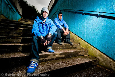
 Finally here’s a few of my favourite images from the shoot


9 comments:
Really love it. Terrific stuff. I'm a huge fan of all your tutorials and teaching methods. Very useful and inspiring for a young photographer just opening up a studio. Thanks!
Thanks Jonny and good luck with the new studio.
Gavin loved the B&W image, so much atmosphere. I especially thought that the grainy appearance, I presume by using a high ISO, added a certain sinister feel to the image and made it look very much like a CCTV capture. Please continue with the tuts as I find them very informative and a great help to my own photography.
These are excellent shots!!! I'd love to take photos like these!!! (so best get practising!)
JAJT: CCTV was exactly the look I was going for. In fact that underpass is probably one of the very few places in Crawley that doesn't have CCTV and one of the few places that could benefit from it.
Grain was added in Lightroom 3
Karen: Thanks for the kind words.
Yeah, you've definitely helped me in my strobist adventures.. I've seen a few of your tutorials as well, and they're very informative and easy to follow.. I love your step by step approach and how you are explanatory enough for even a novice to follow along.. Thanks..
Great shots Gavin. As always, you're giving me something to aspire to. I love your work and your tutorials and video's are great.
very nice; great setting and well shot.
and the picture fits the product I guess....
just personally I think the blue (coats) are pulling a bit too much attraction; I would have desaturated those a little more.
What I really like is the greens in the background!
Post a Comment