Monday, 14 March 2011
Quick Shot Answers No.2
My favourite lens for portraits
How to make dreamy water shots
Advice on Macro lens choice
Tips on Auto exposure bracketing
Wednesday, 2 March 2011
Perfect pure white background - Studio lighting tutorial
In this first video I revisited the pure white background tutorial I made several years back. Since that original video I've refined the technique which now contains more accurate and useful information for anyone looking for the perfect white background.
Wednesday, 23 February 2011
RAW Double Process - HDR effect.
Now, normally I don't show the Photoshop techniques I use to create the photos from the 15 minute challenge photo challenge. Please understand, that's not for any reasons of secrecy, I just think you would be very disappointed at how little I actually do to the images. On the few occasions I show people they often end up saying... "and that's it!"
However such was the lighting at the Gatwick Aviation Museum, where I filmed the photo challenge, that Photoshop played a much bigger role in the image creation. So here's a short video demonstrating one of the techniques I employed.
Friday, 18 February 2011
Quick Shot Answers No.1
 Questions in this video.
1- How do I minimise noise ?
2- How many studio lights do I really need?
3- Does Elements have the same RAW controls and Photoshop?
4- Why can’t open Nikon D3100 RAW files in Photoshop CS5?
Wednesday, 16 February 2011
Hasselblad H4D - Experience and thoughts
A few weeks back I received an email from Hasselblad offering me the chance to get hands on experience with their H4D medium format digital camera. A few emails and a brief meeting later, I’d arranged to shoot a couple of studio lighting videos at Hasselblads shiny new studios in London. They’re coming soon, but for now here’s my thoughts on the camera.
Dream camera?
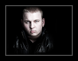
Hasselblad is a name I’ve been familiar with since my earliest days in photography. It’s a brand that many photographers aspire to and comes with a price tag to match. But for some professional photographers the initial cost isn’t an issue when quality is all that counts and I tell you right now the H4D produces images with amazing sharpness and detail, far in excess of my usual Canon 5d Mark II.
For my day in the studio I’d lined up Delaney, an up and coming rapper, to be my model. Hasselblad had promised to loan me a H4D-31 for the shoot. It has the smallest sensor in the H4D range, but at 30 million pixels small is a relative term. However when I arrived the H4D-31 was unavailable, so instead used the midrange H4D-50 which packs a massive 50 million pixel sensor. Other then a bigger sensor the two cameras are identical.
If it's heavy it must be good
First impressions of the H4D is that it’s a big, heavy camera, but surprisingly comfortable to hold. When I swapped the standard 80mm lens for a 35-90mm zoom, the H4D became very heavy indeed, which may explain why so many Hasselblad owners prefer to use a tripod.
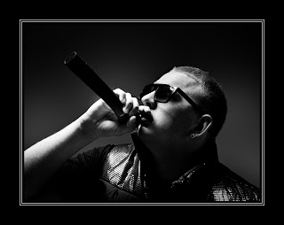 In use the H4D was as easy to operate as any DSLR camera. All the usual shooting modes are there (Aperture, Shutter Priority and Manual). Half pressing the shutter button will lock focus and exposure just like my DSLR. Perhaps my favourite feature was the “True Focus” function, which allowed me to retain focus on a subject even after I’ve recomposed the shot. Believe me it was clever stuff.
Pressing the shutter button is a satisfying experience. A half press will focus, which isn’t fast, but it works just fine. Fully press the shutter button to take the shot and you’ll hear a very satisfying clunk. The image pops up on the cameras LCD almost immediately for review.
The drawbacks
So it’s good news all the way then? Well no. The 50 million pixel sensor produces a 75mb RAW file, so you’ll need lots of memory cards, lots of hard drive space and a fairly beefy computer to process them all. You’ll also need a spare battery for the camera as they drain surprisingly fast.
Such is the clarity and resolution of the camera that every little detail is visible. So for example on portraits, every minor pimple, dry skin patch or makeup mishap will need retouching. Don’t believe me? Take at look at this actual pixel view… Click to enlarge. The yellow square shows you the area I've enlarged. No sharpening has been added, this is straight from the RAW file.

So would I buy one… No. Good as the camera and lenses are, it’s really not going to suit by style of photography. However I’d definitly use one should the need arise, but I'd opt for the hire service that Hasselblad offer on their gear.
Would I recommend one? Well that depends on what sort of photography you do. If you shoot sports, wildlife, need high ISO or prefer to travel light then no, stick to a DSLR. If you shoot landscapes, portraites or still life work, and demand nothing but the best quality images, then this camera should be on you're radar.
And Finally... 
I recorded a couple of videos whilst at the studios. This shot of Sam is a test shot I snapped whilst I figured out one of the lighting set ups. We all loved the background which is made of large pieces of foam. It's the stuff that's usually used to sound proof music studios. I'm pretty sure most of it would have mysteriously disappeared had it not been firmly glued to the wall. Great idea that.
Wednesday, 2 February 2011
Selective colour in five steps
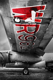 Selective colour is one of those little Photoshop tricks that’s well worth keeping up your sleeve. The effect is hardly new, cutting edge or revolutionary, but it can still make an eye catching image providing it’s used sparingly.
The basic idea is simple enough. First find a standard colour image that contains a bold area of a single colour. That done you’ll need to select the colour and turn everything else black and white. OK, that sounds easy enough doesn’t it, but how do you select just one colour from an image?
Take a look at the image opposite to get an idea of the direction I’m headed. So let’s begin.
 Step One
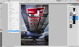
First open your image, apply any processing you wish and if your image has multiple layers save a copy and then click Layer - Flatten Image to collapse all the layers down into a single background layer.
 Step Two
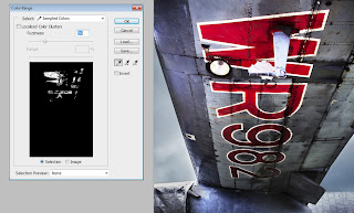
Click Select - Color Range to open the color range selection tools. If you’ve never used this tool before don’t worry it’s all nice and straight forward. Moving your cursor over the image will turn it into a colour sampler tool. Click on the colour you’d like to select, in this case red lettering, and have a look at the result on the Color Range window. White shows the selected areas and black shows unselected areas of the image.
 Step three
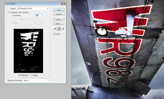
Either increase the fuzziness to enlarge the range of similar colours sampled or click on the Add to Sample eyedropper and click on more areas of similar colour. Continue until the area of colour you want to select has turned white in the preview window and the majority of the remaining image is black. Remember CTRL+Z will undo your last click… handy to know if you accidentally sample in the wrong spot.
 Step Four
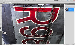
Now this is the bit that seems wrong, but trust me it’s important. Click Select - Inverse.
The chances are there will be areas selected that are the same colour as the thing you wanted to selected, but are not part of it. Remove these using any selection tool you like (free hand lasso is a good choice). Remember to hold Shift as you draw your selection.
 Step five
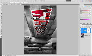
Click Layer - New Adjustment layer - Black & White and the colour will disappear from the image except the area you selected. The back and white areas can be adjusted by moving the sliders on the Black & White adjustment layer to create a mono look that compliments the image.
So there you have it, selective colour in five easy steps.
Tuesday, 11 January 2011
Out of bounds effect made simple - Photoshop
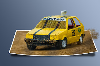 It’s high time I made another Photoshop video tutorial. After a few minutes scratching my head thinking what I should do, I took a quick look back through your Quick Shot Questions. One Photoshop question kept coming up which was this… “How did you make that pop up image at the end of the abstract background tutorial?”
The technique is known as out of bounds and as the name suggests the idea is to make part of the image poke out from the frame.
Despite appearances the technique is fairly straight forward when it’s broken down into a few simple steps as you’ll see in this video.
